Sunday, November 3, 2013

Not Fade Away: Behind the Scenes


My first big solo exhibition titled "Not Fade Away" at Buffalo Arts Studio is closing November 9th.  The center piece of this show is the interactive paper mache sculpture I created of the Buffalo Central Terminal.  This blog focuses on it's construction.

The exhibition as a whole took me three weeks to set up.  The first week I was focused on printing my linoleum blocks of Buffalo Architecture.  The next two weeks I built the Buffalo Central Terminal sculpture.  The last two days I created the illustration on the wall and hung the artwork.


Regarding the sculpture I knew I was going to make one of the BCT for a couple months prior to the show.  I had made a couple models and created around 150 sketches.  It wasn't until three weeks before the exhibit that I had the idea to have people walk through the sculpture.  The interior was fascinating to me because there were so many possibilities for what to put inside.  In the end I decided to go minimal thereby creating an anti-climactic effect.  The unexpected is important in art, and to make the interior of a monumental sculpture quiet, contemplative, and intimate I thought would create enough of a variance to shake up the audience.   To further contrast the exterior with the interior the video that I chose to display increased the vulnerability and sentimental aspect of the piece.  Anyone can interpret the work of art themselves, the way that I see it is that the video of the young boys from the 1950's playing with their trains represent a kind of inner child of the terminal and/or a loss of innocence... Of a terminal once glorious but now having been used and abused by weather and human hands.  Amid the distorted exterior and raw skeletal interior you have at it's core the terminal's vivid imagination and child-like wonder that gave it creation in the first place... In other words deep within the shell of the building exists a soft innocent core that has survived decades of abuse.


Photos of the exhibition...


From my sketchbook and models...


Tuesday, October 29, 2013

Banksy and Me: New York City


I've been waiting to write this blog for some time.  I heard of Banksy several years ago from a friend.  Like most people I was pretty freaking amazed by the images I saw of his work online.  A couple years ago I watched "Exit Through The Gift Shop"... a kind of documentary, most likely a fake one.  And every so often I look up Banksy videos on You Tube to see what he's been up to, especially with his "fine art" exhibitions in gallery spaces and museums.

As probably many of you know Banksy has been in NYC for the month of October of this year.  While visiting New York to straighten out some things with the city I tried to see a few Banksy's before they're all tagged over, washed off, or boarded up.  His stay in NYC has been an unwelcoming one... pride and jealousy have overcame local street artists and they haven't spared anytime to piggyback on all the attention he's getting by tagging up their names in attempt to gain some recognition.  Oddly, while I was taking some pics of the dog and hydrant stencil (above photo) an older guy came along and started taking cell phone pics... but not because of the Banksy, because of "RD" who tagged the Banksy hydrant.  According to this guy "RD" is a legend and has a rep for hitting up hydrants in the city.  At first I thought it was a joke, but this older fellow was so genuinely thrilled to see "RD"'s tag that it put a smile on my face as I thought: "this guy's for real yo!".

Here are some thoughts...

1.  How the hell has no one taken a photo of Banksy or not come out with his true identity!  That's amazing that he's pulled that off!  Ok, maybe that pic in Jamaica of a dude cleaning off his stencils is Banksy but its not proven.  Check it out 
http://www.dailymail.co.uk/femail/article-1034538/Graffiti-artist-Banksy-unmasked---public-schoolboy-middle-class-suburbia.html

2.  "Banksy" has to be a team of people... In order to not get caught he needs look out guys and also help with some of his stencil work, which can be very complex at times.

3.  No doubt Bansky's "fine art" is reminiscent of Warhol and can be linked with "Bad Art" artists  like Jeff Koons, The Chapman Brothers, and Paul McCarthy.  His gallery work I've never seen in person but I don't like it... Especially his mechanical sculptures...It's manufactured art... Art that he has other people make.  What's so attractive about his street art is that it's made by hand yet has mechanical precision... That's why people are awed by it.  His "fine art" has no awe and just makes him look wealthy enough to make work expertly fabricated.  Check it out 
http://www.youtube.com/watch?v=NPxn5-ADFm8

4.  Similarly, Bansky is a conceptual artist.  He's a clever chap!  Which is why his street art is so effective... He really utilizes the inherent characteristics of his surroundings and transforms them into biting political commentary.  He's like an designer, illustrator, or political cartoonist... but again, when he ventures to sculptures and gallery shows his work looses that connection to his immediate surroundings and the audience is left without that transformative experience of space.


5.  Banksy's "fine art" is very funny... that humor is what gives it some interest... at least he doesn't take himself seriously!

6.  Banksy's New York work, coming to a closure this week, is pretty amateurish... at least his stenciling.  Those lucky enough to see his Ronald McDonald sculpture and truck "installations" as they drove around the city might have had more of an effect on his audience... but I didn't see any of those pieces.  The works that I did see, which I've posted on this blog, I wouldn't have cared about or taken photos of if I didn't know they were Banksys.  They were not like the ones I've seen online and I wonder if photographs of his pieces are more interesting than the works themselves... in part because they crop the rest of the busy city context out of the frame.  Maybe its just New York, but his pieces had no presence to them... they were swallowed up with all the other graffiti, rubbish, and urban decay that surrounded them.

7.  This is a great link that maps Banksy's artwork across the city: http://www.villagevoice.com/microsites/banksy-nyc/


Good luck Banksy!  I hope to see your work again sometime.


Sunday, October 20, 2013

The Burchfield Penny: Front Yard


How could I resist going to the unveiling of unique art project in Buffalo, NY Friday night.  The Burchfield Penny Art Center at SUNY Buffalo State turned on "the world's first permanent, environmentally-responsive, 24/7/365, outdoor new media gallery" forever.  The three projection towers are the real attraction... the audio and video are icing on the cup cake.

According to Art Voice...
The Burchfield Penney is billing the Front Yard as “the world’s first permanent, environmentally-responsive, 24/7/365, outdoor new media gallery,” and indeed it is unique: In addition to the fact that it will permanently transform the long, gray wall of the center facing Elmwood into a projection surface, sensors on a weather tower will read environmental conditions—temperature, humidity, wind speed and direction, precipitation—and summon corresponding images and sounds. This sensitivity to weather is an homage to Charles Burchfield, the center’s namesake, whose work dealt extensively with changes in seasons and climate.
But what makes this installation even more unusual in art world is that it is both an art project itself and a permanent, changeable tool with which other artists can work.
“The openhandedness of what Brian and Brad have done, the generosity of it, is unique,” says Anthony Bannon, the Burchfield Penney’s executive director, in describing the project, which is a collaboration between architect Brad Wales and his Small Built Projects class at the University at Buffalo and video artist Brian Milbrand, who is technical director for Buffalo State College’s Communications Department. “Their art is to create the means for others to make art.
“Essentially what we’ve done is to build a system for the algorithm that becomes an artist’s pallette.”

According to the Buffalo News...

And after the sky turns dark enough, an ever-evolving series of videos will flicker across the building, inevitably prompting drivers to slow to a crawl along the busy avenue and scratch their heads over some snippet of beauty or visual noise they would never otherwise have seen.
The videos thrown up on the center’s wall will range, as they did on the installation’s opening night, from the pioneering work of Buffalo’s much-ballyhooed media art movement of the 1970s to new video and sound works from local contemporary artists.
As the sun rises each morning, the Burchfield’s facade will return to normal, but a powerful 6.1-channel surround sound system will run all day, every day, featuring a rotating series of work by sound artists that will also respond to environmental changes.


Saturday, October 12, 2013

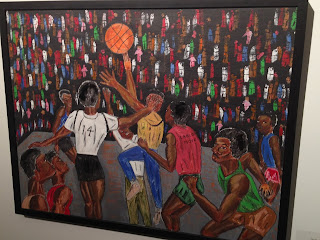
LeRoi Johnson and Reo Gallery


Reo Gallery opened up Thursday evening on Main St. near Summer in Buffalo, NY.  LeRoi Johnson had the honor of having the first exhibition to christen the old car showroom.
 
According to http://leroicallwelljohnson.com…
Born in Buffalo, New York, LeRoi C. Johnson was raised a catholic in an eastside project in Buffalo, New York and later became a prominent Buffalo attorney. He is a Canisius College graduate, attended the University at Buffalo School of Architecture and Design and is a graduate of Georgetown University Law Center.
LeRoi is a remarkable painter. He is almost completely self-taught. His early bright colorful work is implicitly autobiographical in theme. Among his influences are his training in commercial art and his sophisticated African Art Collection of thirty years. He successfully fuses geometric abstraction with both his personal experiences and African themes. Lately his style has altered; it has become less geometric and more representational of his human experience, especially as an African American. He is now less personal and more antidotal.
Here are some thoughts...
  • His work seems to fit into three categories… personal, decorative, and commercial.  I favor his personal works.
  • The pieces that are most successful are those that keep to a traditional kind of format... his cubist and surreal paintings seem less authentic and lacking in substance... in other words, the simpler the painting the better, ie. the basketball players,  the naked African woman supposedly leaving her husband and home, and the man at the train station

Here are some of my favorites from the show...


Sunday, October 6, 2013

Allentown: First Fridays Gallery Walk

K. Patterson-Tanski

I was invited to submit some work to a group show at Glow Gallery on Allen St. in Buffalo, NY... I got in so I decided to check out the opening of the show which coincided with Allentown's "First Fridays Gallery Walk".  I made it to Glow Gallery, College Street Gallery, and Pausa Art House.

The selected images are pieces that I gravitated towards... I arranged them in no particular order...

Rich Tomasello

Eileen "Pleasure" O'Brien

Neil Maher

Tim Raymond

Pat Pendleton

John Farallo

Eric Evinczik

Christopher McGee

Alejandro Gutierrez

Unknown artist painting in Pausa Art House

Thomas Webb

Your's Truly... Dan Galas

In the window of Glow Gallery


Thursday, September 26, 2013

Buffalo's Outer Harbor Wind Sculptures


I visited this new park off of route 5 going south the other day.  I was really impressed.  I didn't think I write a blog about this patch of grass and sand before I got there... but I think it deserves some recognition.

Some thoughts...

The kinetic wind sculptures are so beautiful and mesmerizing.  I don't know if this is standard for wind sculptures but I've been to many parks and never seen any quite like this

I could not determine the artist who created these... for all I know they can be mass produced and made in China for cheap (hopefully not true).  If you know who made these let me know please

The design of these wonderful and imaginative structures is minimal... nothing fancy about them... they just move in interesting ways and their simplicity of construction and design is so elegant that those qualities alone are enough to attract and excite the viewer/park-goer

Of course I couldn't help myself taking a few pictures of those cool looking trash cans and slides.  The view of the city from that location is interesting too... the grain elevators and skyway are front and center and the City Hall appears peaking over a few smaller buildings giving it an odd skinny kind of look