Friday, December 28, 2012

The One That Got Away: Christopher Astley


Collage
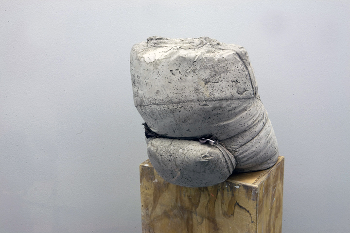
Of the exhibitions that I visited this past year and blogged about there was one show that I forgot to post.  "Mayhap", an exhibition of Christopher Astley's new sculptures, collages, and paintings at Leo Koenig in Chelsea, was on view from May 24th to June 30th of this year.  I first saw Christopher's art in a glass window display near Chinatown and SoHo in 2010.  What struck me about his work then and now is the curiousness of form, texture, and color of these little pillow and bag-like sculptures.  I love them!

These anthropomorphic mostly "concrete-filled fabric bags" remind me of Phillip Guston’s painted pink clunky forms piled up and stretched along a distant horizon.  It's primarily the bulkiness of form and distressed surface texture that excites the artist in me so much.  But the exhibition I saw in June also contained two-dimensional work that I was not at all familiar with.  

Painting
His photographic collages of numerous sculptures crammed into the frame and the sheer quantity of his sculptures packed into the tight gallery space detracted from the strengths of his sculpture by kind of “pop-ifying” the work.  By "pop-ify" I mean to make cute and turn these otherwise odd and sophisticated individual objects into commodities like mass produced toys piled up at a display in a mall.  Also, the slick and clean surface of his two-dimensional work I thought didn't mesh well with the tactile, worn, and tattered feel of his concrete and fabric sculpture.  I'm curious to see what direction Christopher Astley takes his art next.

Here is an excerpt from the Mayhap press release...
Highlighted by large-component sculptures made up of concrete-filled fabric bags, Christopher Astley’s work provides a metaphorical antidote to the lightning-fast environment in which most of us find ourselves. Grounded in the notion of thought as a diverse series of closed systems and pattern recognitions, and stressing the importance of novelty, Astley’s constructions take the form of walls, but are neither barriers nor boundaries. Greatly influenced by emergence theory, whereby complex systems and patterns arise out of a multiplicity of relatively simple interactions, Astley’s arrangements are dependent upon a few simple relational assemblages and go on from there. Though the objects are of formidable weight and volume, individually, they seem almost buoyant and animated by the fabrics that contain them. Seemingly unmoving, the shapes in their nearly figurative arrangements reveal a slowly shifting lexicon, strangely both whimsical and adamant.
Astley’s directives when making his sculptures are only loosely built around manipulating form. Often sewing the bags that hold the concrete, Astley fills each one with the mixture and allows the curing process to partially assist in the creation of the individual shapes. Irresistibly tactile, sometimes the results are within the realm of expectation. Other times, the results are completely unanticipated, bending unevenly to the rules of gravity, chemical reaction, and time. It is the surprising event that Astley is striving for. Though patterns are established by arranging the individual bags, nothing is ever pre-arranged in the artists mind. Like water seeking its own level, Astley’s constructions often seem to seek their native resting place, as if the forms themselves are territorially prescient.


***FYI I seemed to have lost my pictures of Mayhap so the images 
included here I borrowed from the Leo Koenig website.


Saturday, December 22, 2012

Tokyo 1955-1970: A New Avant-Garde

Tadanori Yokoo

I ended up seeing this show by mistake.  I thought I was going to see Matisse, but then I remembered that show was at the MET.  Whoops.  Anyway, this exhibition is up at the MOMA until February 25th, and I'm glad I ended up experiencing it.

There is something unsettling about this show.  Most of the work is subtle, conceptual, minimal... you know, nothing terribly shocking.  But the repetitive sonar pulsing in the background and muddled sounds of wolves growling from the far back gallery gave the work a haunting and ghostly presence.  These sounds didn't let the audience forget that the art in this exhibition was made soon after two atomic bombs had devastated Japan.  Some pieces seemed to be explicitly be related to the horror of WWII, like Ikeda Tatsuo's illustrations and the black and white photography of Moriyama Daido', while most work only quietly allude to it or did not seem to relate to it at all like Yayoi Kusama's drawings and paintings.

I am glad to have been introduced to artists Tadanori Yokoo, Akasegawa Genpei, Kojima Nobuaki, and Takamatsu Jiro.  I personally can relate to the aesthetics of Genpei's wrapped objects.  They divorce the objects of their utilitarian function and amplify their abstract form, which I find myself doing often in my paintings.  I also find solace and selflessness in Jiro's minimalist sculptures and I can't get enough of Nobuaki's folky flag sculptures.

For more information about the exhibition the MOMA has this posted on their website...


Tokyo lay in ruins in August 1945, when the Allied Powers entered Japan at the end of World War II. Under their occupation, which lasted until early 1952, the formerly militarist, imperial nation was transformed into a pacifist democracy, poised to become an economic powerhouse. In 1956, barely more than a decade after the war, the government announced that the postwar era was over.
Beginning at that historical threshold, this exhibition covers a crucial decade and a half of artistic and cultural efflorescence in Tokyo. Artists working in the city reckoned with still-fresh memories of war and devastation, ongoing political turmoil, and great social and cultural changes. Their works are often characterized by a profusion of transmuting figurative forms, the use of the artists’ own bodies, and a vigorous engagement with the exploding world of popular imagery and the detritus of industry and consumerism. Cross-genre and intermedia experiments also thrived.
Tokyo 1955–1970: A New Avant-Garde provides a focused look at the extraordinary concentration of creative individuals and practices in the dynamic city during those turbulent years. Featuring works in various mediums and disciplines, the exhibition offers a story of artistic crossings, collaborations, and conflicts, with the city as an incubator, introducing the myriad avant-garde experiments that emerged as artists drew on the energy of the rapidly growing and changing metropolis.

Akasegawa Genpei

Narita Katsuhiko

Yayoi Kusama

Kojima Nobuaki

Ay-O

Moriyama Daido

Takamatsu Jiro


Sunday, December 16, 2012

Tal R: The Shlomo


Tal R, who's art I have been following on-line, is now showing at Cheim and Read in Chelsea.  The exhibition continues through January 5, 2013.  In a nut shell he was born in Tel Aviv, is half Czech and half Dane, is of Jewish faith, considers himself an outsider, and uses the interesting medium of pigment mixed with rabbit skin glue.  The publication for the exhibition makes comparisons of his painting to Matisse, Klee, Duchamp, and I believe Chagall.  

Anyway, aside from his bio, technique, and influences, his art is beautiful in its simplicity.  I love his use of dull yet vibrant colors which gives his work an aged feeling.  His use of dry-brush technique gives the surface of his work a sensual and rich texture.  The subject matter (in most of his paintings in this show) is anachronistic and the aesthetic is more backwards looking than forwards looking.  However, I sense real authenticity in his work and originality.  There's a kind of quiet confidence about these paintings, even though I don't like all of them.  

In these works there is a kind of loneliness... a simple child-like curiosity of a single mundane event.  It's so refreshing to experience work like this at a time when so much art, advertising, media... all sorts of stuff compete for our attention and do violence on our senses.  Most of Tal R's paintings grow on you slowly... they enter your imagination and then give you something new each time you see them.  The size of these works too is just right... perfect for the size of the Cheim and Read Gallery.  Go see the show.


Here is the Gallery's press release...

Cheim & Read is pleased to announce an exhibition of recent paintings by Tal R. This is his first exhibition with the gallery. The show will be accompanied by a full-color catalogue with an essay by Matthew Israel. 
Tal R was born Tal Rosenzweig in Tel Aviv in 1967 to a Danish mother and Czechoslovakian Jewish father. Raised in Denmark, his childhood was defined by his family’s split identity: the orderly Scandinavian society of his maternal side contrasted with his father’s experience as a Holocaust survivor. Tal’s traditional Hebrew name, which also means “number” in Danish, did not assist in his acclimation, especially among school-aged peers. Drawing provided a needed escape. As he has said: “For me, drawing was the same as dreaming at night: you don’t decide what to dream about, you dream about what you need.” Tal’s self-identification as an outsider, caught between two worlds, fueled a fertile artistic landscape of shifting realities. His unique vision eventually led him to the Royal Danish Academy of Fine Arts, where his work caught the eye of Louisiana Museum curator Anders Kold.
The duality of Tal’s heritage is recognized in his work, which offers sensations both celebratory and sinister. Saturated color is weighted by shadow; café and street scenes, festooned and radiant, are simultaneously claustrophobic and labyrinthine. His subject matter is intentionally easy to describe, but meaning, as in dreams, is enigmatic. Tal works with a variety of media—collage, sculpture, installation, painting—and intuitively culls imagery from diverse sources. (He cites the Yiddish word kolbojnik—“leftovers”—as a loose definition for his process of gathering inspiration.) Historical and art historical references abound: threads of Expressionism, Fauvism, and Symbolism run throughout, as do nods to traditional Scandinavian art, Art Nouveau, and outsider or children’s art.
For this exhibition at Cheim & Read, Tal presents a group of carnivalesque-like canvases, patterned with psychedelic stripes and sometimes inhabited by a character named Shlomo (short for Solomon, Shlomo is also Tal’s middle name). Shlomo is both formalist prop and narrative force; his presence lends a sense of ennui to otherwise vivid compositions. Kandinsky-like color vibrates in paintings like Night Awning, 2012, and Klee-like patterning creates the patchwork construction of House Bonni, 2012. Girl Sitting Next to Marie, 2012, references the art historical canon of café imagery, but is bordered by darkening shadows. Amusement park scenes – The Swan and The Swans, both 2012, glow unnaturally and are turned on their sides, as if stolen from a child’s imagination.
Tal achieves his translucent color by mixing pigment with rabbit skin glue. Fast drying, the medium does not accommodate multiple layers or revisions—paint is applied quickly and confidently, resulting in canvases which emphasize surface even while presenting scenes of mysterious depth. The viewer, at first bombarded with color and texture and then becoming cognizant of narrative structure, is left to navigate splendid but distorted passageways, as if entering an unhinged dream. Tal’s work reveals the effect of an image on the psyche—the viewer’s own unconscious is an active participant in the scene.


Sunday, December 9, 2012

Emerge: An Exhibition I Curated in Manhattan

Grace Knowlton

One of the great benefits of writing this blog is the opportunity it affords to meet other artists.  For that reason alone it's worth posting blogs weekly.  So back in August I began curating a group exhibition of some of my favorite artists whose work I was lucky enough to blog about this past year.  The title of this exhibition is "Emerge" and it just opened at Indian Road Cafe in Inwood in Upper Manhattan.

I chose the title "Emerge" for two reasons.  1) I met almost all of these artists through my blog "Always Be An Emerging Artist"... hence "Emerge".  2) all of the work in this show exhibits a kind of quality of emerging... emerging in the sense of form and shape surfacing to the viewer's attention, on abstract shapes and textures gradually revealing themselves, and on recognizable places and things, like a hand, a landscape, or a microorganism, appearing out of abstraction or vice versa.

Other common characteristics of pieces in this show are texture, layering, modest size, banal subject matter, minimal composition, contemplative form, and simplified shape.  There is no ego in these works, no assertion of the character of the artist.  These paintings, drawings, weaving, sculptures, and ready-made exist on their own, asserting their unique curiosity upon the viewer and inviting the viewer to "fill in the blanks" and participate in their process of becoming or creation.

"Emerge" will be on view at Indian Road Cafe at 600 West 218th Street from now until January 15th.  Thank you to all the artists participating in this exhibition.


*note: most of the photographed images below were not photographed at the exhibition

David Provan

Douglas Florian

Gretchen Kane

PD Packard

Karin Dando-Haenisch

Jacqueline Sferra Rada

Daniel Galas and Ben Straevindi 


Sunday, December 2, 2012

Douglas Florian: Studio Visit


I've been planning a group exhibition at the café in Inwood that I curate art shows for.  I've asked some of my favorite artists that I've either met or blogged about this past year to participate in this show.  Grace Knowlton, David Provan, Gretchen Kane, Jacqueline Sferra Rada, Karin Dando-Haenisch, David Bernstein, and PD Packard have all agreed to exhibit their art along with Douglas Florian.  I picked up two paintings from Douglas' studio in Hell's Kitchen this past Wednesday.  In case you don't know Douglas is an accomplished children's book writer and illustrator (I included a few images of his illustrations).

Douglas is a super nice guy. He has no ego, nothing to prove to himself or others, and he's great listener.  I asked him who some of his favorite artists were and he replied Paul Klee and William Hawkins; one artist that champions outsider art, and the other a genuine outsider artist.  I also asked him how his children's book illustrations and his paintings relate.  He told me that he thinks of them as two different bodies of work; he typically works on illustrations for a long stretch of time and then works on his paintings for a long stretch of time.  He does not work on both simultaneously.

Another curious thing I learned about Douglas' work is that he often uses gessoed brown paper bag to paint on.  He almost exclusively uses this surface for creating drawings, but has chosen to do most of his paintings on wood... Sometimes on wood that he has found and sometimes on wood that he has bought new.  However, both his paintings and drawings express a love for texture, abstracted form, humor, and centered composition.  I too share those interests of his.

Douglas Florian is one of my favorite artists. I am very happy that, even though he is represented by Bravin Lee, he has agreed with enthusiasm to show two paintings at Indian Road Cafe started next week and showing till January 15th.