Sunday, January 27, 2013

What I Learned About Matisse

Bowl of Apples on a Table 1916

I visited the Metropolitan Museum of Art in NYC yesterday to see the exhibition: Matisse In Search of True Painting.  Matisse has always been one of my favorite artists, but of the two complimentary exhibitions in New York this winter, Picasso: Black and White, and this one, I surprised myself in preferring the Picasso.  Still the best Matisse exhibit I have ever seen is the permanent exhibit at the MOMA.  This current show didn't seem to have anything terribly new to say about Matisse.

The most interesting part of the exhibition was the room where they had presented three finished paintings of Matisse's alongside photographs of those same paintings at different stages of being completed.  I remember watching a documentary on Matisse and Picasso several years ago. One difference between the two artists is that while Picasso would paint over work that he did not like and build up surface texture in the process, Matisse would scrape his paintings to remove all traces of there having been layers to the work so that the finished painting looked like it had been created in a single sitting.  I'm sure this technique of Henri's varied throughout his career but the examples at this exhibition all had this process in common.  For, example "The Dream" (below) looks so fresh as if painted in a few hours, but instead it was laboriously painted and re-painted and not finished until nine months had past from its start.

The Dream 1940

The Dream 1940
I was very glad to learn that I have a favorite time period of Matisse paintings.  The work he did in the mid-teens of the Twentieth Century are by far some of his greatest works.  They have a somber, introspective mood to them which is unlike the bright and colorful Matisse we normally think of.  The compositions in these works, the subtle changes in texture, the way the muted blues react to sparks of lively color, and the way Matisse simplifies and abstracts shapes and forms give these paintings an emotional depth, an inventive imagination, and a power that hits the viewer in the heart and mind.   According to the Met the four years from 1913-17 was full of "experimentation and discourse with the Cubism of Pablo Picasso and Juan Gris.  The resulting compositions were much more austere, almost geometrically structured and at times close to abstraction."

Interior with Goldfish 1914

Interior with a Violin 1918

Goldfish and Palette 1914

Notre Dame 1914
The other lasting impression the Matisse exhibition had on me has to do with three very odd paintings, one of which you can view below.  The "Large Cliff" paintings from 1920 are unlike anything else I've seen from Matisse.  I don't like them one bit and that's why I can't get the sight of them out of my head.  Their compositions are all the same, which are not very interesting... they're not the dazzling compositions moving the viewers eye around and around the picture until you have glanced at every inch of the canvas.  The focal point in all of these paintings is this unattractive washed up seaweed with either an eel, fish, or two rays in the middle of it (depending on which of the three paintings you're looking at) with a boring pastel landscape surrounding it.  I don't know, I don't get it... do you?

Large Cliff, Eel, 1920
Here are a few more paintings from the exhibition that I that were worth showing... enjoy.

Nude with a White Scarf, 1909

Still Life with Compote, Apples, and Oranges 1899


The Large Blue Dress, 1937


Le Luxe II 1907-8

Woman on a Divan 1920-21


Interior with Egyptian Curtain 1948

Notre Dame 1902

Young Sailor I 1906

Monday, January 21, 2013

Picasso: Black and White Exhibition: Top Ten

The Milliners Workshop, 1926

I had to see this exhibition before it ended today,after all, that's why I moved to New York: to experience world class art shows like this one.  This is what I think about Picasso in a nutshell...

No one else that optimizes the changes in visual art from Classicism to Modernism
He was a wizard of visual language... throughout his life he experimented with all the elements and principles of design in such a plain and primitive way
Picasso could soar with his paintbrush and take us on a trip to extreme pain, despair, love, and joy
Many Picasso paintings are crap... just like the pieces in this show, about half are vain, playful without depth, and repetitive
I admire Picasso for making both great and crappy art... good or bad he was always himself and one of his greatest lessons for painters is not to get hung up on making every painting a masterpiece
His way of transforming a simple still life into a magnificent invention of imagination was his greatest gift
 I love his innovative approach to almost any and every medium of visual art he could get his hands on
His studies were as interesting as his finished pieces 
Picasso was prolific but he had money and assistants so don't worry about producing the quantity of work he had produced in his lifetime
A great book on Picasso is John Berger's The Success and Failure of Picasso

The images of my ten favorite pieces from the Black and White exhibition at The Guggenheim Museum of Art are roughly ranked in order from 1-10... the first of which being best in show.

The Maids of Honor, 1957

Visual language at its best... flow of the composition, light and shadow, interplay of detail and simplicity, 
flat space to depth

Still Life With Blood Sausage, 1941

Plain subject made inventive and expressive... great composition, diverse textures, simplified forms


Woman Ironing, 1904

Picasso's early work reminds me of Bob Dylan's early folk music... very expressive, sincere, modest, powerful

Bust of a Woman with Arms Raised, 1922

Simple subject matter and composition yet full of expressiveness and beauty

Bronze Skull, 1943

As raw as it gets... yes it's disturbing in its horror but is an expression of the time it was made

Man, Woman, and Child, 1906

I love the raw, expressive brushwork, shapes, and forms... this painting is so beautiful and so human

Head of a Horse Sketch for Guernica, 1937

The power Picasso is capable of in his image making... the anguish, pain, devastation

Swimming Woman, 1934

Look at her face!... what an odd and ingenious way of rendering it 

Study for Sculpture of Head, 1932

This drawing shows Picasso's mastery of classically trained techniques and imagination/invention


Bust of a Woman, 1932

Modest in simplicity but so lovely, warm, and beautiful

Sunday, January 13, 2013

Bryan Hopkins' Ceramics: Perfect Imperfection


Last week I blogged about the Buffalo, NY art scene.  In it I included some images from three artists in a current exhibition at Buffalo Arts Studio.  One of the artists was Bryan Hopkins.  I liked his work so much that I decided to explore what he had posted on-line and introduce all of you to his ceramics.  FYI all the content for this blog was found on his website www.hopkinspottery.com. 

Bryan received his MFA from SUNY New Paltz in 1995, he has been an adjunct professor at Niagara County Community College for the past 15 years, and he has shown his work extensively throughout the country.  Bryan categorizes his work into two groups... Function and Dysfunction.  The functional work "Follow[s] in the lineage of 'fine china' I produce objects for domestic service, adding my own sense of affect and defect. The work’s primary use is that of a utilitarian object, and all the pieces perform as they should".  The dysfunctional work "is based on the premise that the clay vessel is capable of more than holding fruit, presenting flowers, or decorating a sideboard, and that there are additional functions of the vessel, such as containing the intangible (light, shadow, idea)".  His inspiration for his ceramics is diverse and encompasses "my urban environment, Modernist architecture, backyard forts, Gordon Matta-Clark, 19th century European porcelain, Minimalism, Bugs Bunny, and Song Dynasty porcelain."

According to Bryan...
"The juxtaposition of glazed and unglazed surfaces combined with industrial textures not typically associated with porcelain produce a tension in the work, and is at odds with porcelain’s implicit societal qualities (upper-class association and assumption of purity and preciousness). The intimate scale of the work draws the viewer near, creating a more intense and personal dialogue. By leaving evidence of the process of making and using the concept of function as a starting point I allow the viewer an insight for initial interpretation."
Since I'm working on a series of Buffalo, NY architecture linocuts I cannot help but see the rusty, decaying, brick buildings in his ceramics.  The shapes, forms, and textures of his work mirror cinder block, concrete, and wood, and some of the pieces are even anchored to what looks like gray brick.  There's an industrial quality to these pieces that brings to mind one of the most fascinating architectural sights in Buffalo: the weather worn grain elevators that you can see along the Buffalo Skyway.  Bryan's work seems to embody the beauty of these old structures... his ceramics seem to walk the line between mechanical and organic, machine made and hand made, man and nature.  They are excellent examples of how imperfection can be transformed from flaw to depth.

Grain Elevators, www.buffalorising.com

Grain Elevators, www.buffalorising.com


Tuesday, January 8, 2013

The Buffalo Art Scene According To Cori Wolff

Bryan Hopkins

This September I'm having my first solo show at a gallery in Buffalo, NY called Buffalo Arts Studio.  I submitted work to one of their postings on NYFA.org a year and a half ago.  They liked it, and when I brought my art to the gallery for a closer look I was pleased to met their curator Cori Wolff, who is now the Interim Executive Director.  During our meeting I picked her brain on the Buffalo art scene so that I could better navigate it on my own.  So when I was in Buffalo for the holidays I decided to pay Cori a second visit... this time with the intention of picking her brain on the Buffalo art scene while taking notes and then publishing the useful information on this blog.

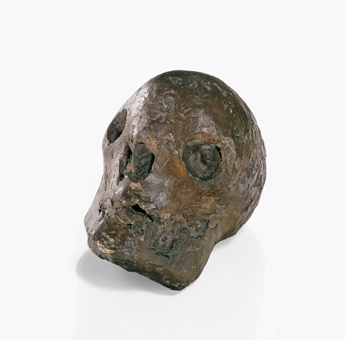
FYI I did not record her every word when she answered one of my questions and I sometimes added to her answer if I felt she left something important out.  Also, the images of art I included in this blog are selections from Buffalo Arts Studio's current exhibition titled Annual Artists Exhibit and Sale 2012.  And thank you Cori Wolff!... if you'd like to read two other interviews of hers try these two links www.buffalorising.com/2010/07/curator-interview-cori-wolff.html and www.artvoice.com/issues/v10n48/five_questions.


What are some of the venues that consistently show good art?

Albright-Knox Art Gallery (www.albrightknox.org)
Burchfield Penny Arts Center (www.burchfieldpenney.org)
Castellani Art Museum (www.castellaniartmuseum.org)
University at Buffalo Art Gallery and UB Anderson Gallery (www.ubartgalleries.org)Hallwalls (www.hallwalls.org)
Big Orbit (www.bigorbitgallery.org)
BAS (www.buffaloartsstudio.org) 
CEPA (www.cepagallery.org)
Squeeky Wheel (www.squeaky.org) 


Is there a dialogue between Buffalo artists and artists from other cities like Toronto and New York?

Buffalo Arts Studio is working on an artist residency exchange with Brew House Association's Distillery Program in Pittsburgh, PA, 
Toronto artists seem to be curious about Buffalo according to Cori because of the high quantity of submissions she receives from Toronto artists and because some directors of arts organizations, including the now outgoing director Louis Grachos of Albright-Knox Art Gallery (to read more about this development you can read this recent article in Art Voice at www.artvoice.com/issues/v11n51/cover_story), are from Toronto. 


Whats are some artist residency programs in Buffalo?

University at Buffalo Center for the arts (www.ubcfa.org/artists-in-residence)
Albright-Knox Art Gallery (www.albrightknox.org/education/artist-in-residence-program)
Hallwalls Contemporary Arts Center (www.hallwalls.org/harp.php)
Art Park (www.artpark.net/content/pages/art-gallery)
CEPA Gallery (www.cepagallery.org/artist_resources/calls/residency.html)
Squeaky Wheel (www.squeaky.org/residencies)


What are the benefits to being an artist in Buffalo?

Low rent
Good location for visiting nearby cities such as NYC, Pittsburgh, Cleveland, Toronto
Great place to start a small business
Cheap taxes
Buffalo is a community that works together... Its not competitive like bigger cities
Artists have opportunities like Art Farms (Artfarms.org) which is an organization that invites recognized artists to design grow sculptures for Buffalo's East Side urban farms.


Are there any informative blogs, magazines, newspapers about the Buffalo art scene?

Art Voice newspaper (www.blogs.artvoice.com/stillbuffalo)
John Massier's blog which is apparently discontinued (jmassier.blogspot.com)
Colin Dabkowski of Buffalo News (www.blogs.buffalonews.com/gusto)
464 Gallery's magazine called Spark (www.464gallery.com/#!spark)


Does artwork sell in Buffalo?

According to Cori Buffalo Arts Studio sells 2 or 3 pieces per show and takes a relatively low commission of 30%.  And there are some serious collectors of art in Western New York that are active in buying art in Buffalo.


What are some groups that young artist can join to integrate into the art community?

ELAB ((www.elabuffalo.com)BAS critique (www.buffaloartsstudio.org/resident-artists/open-art-critiques)


Is there any central neighborhood to the Buffalo art scene?

There is no one neighborhood that has a greater concentration of galleries and studios than other parts of the city.  In a publication for Beyond/In Western New York in 2007, which featured 12 diverse arts organizations, the pamphlet sectioned the organizations into three day trip "regions"... they were Downtown, Parkside (along Delaware Park), and North Towns.


Does the artist in Buffalo favor any particular style or type of art?

Primarily more traditional styles like representational and figurative, although there are many artists doing street art, creating work inspired by urban decay (like City of Night www.cityofnightbuffalo.com), and a growing trend towards new media, book arts, and screen printing


Where are the best places for renting a studio space in Buffalo?

Buffalo Arts Studio has 36 studio spaces subsidized inside the TriMain Center for a monthly rent averaging $180


Bryan Hopkins

Bryan Hopkins

Bryan Hopkins


Roberto Pacheco

Roberto Pacheco

Kathleen Sherin

Kathleen Sherin