Saturday, May 26, 2012

David Bernstein: Playful Performance


Now many of you that are familiar with my blog know that I prefer the art-object to performance art, Modernism to Conceptualism.  But "good" art is beyond personal taste.  When I talk about art being good I'm referring to one thing only: every work of art has inherent in it the criteria by which it is judged... if the art completely transcends these criteria its great, if the art is effective then its good, if it is ineffective its bad, and if the criteria by which it is judged are incoherent its horrible.  I like David Bernstein's work because I get it... his work it concise, clear, creative, and simple.  He's really good at what he does.  Also, I think David's work is successfully positioned between two pillars of art, in short, Picasso and Duchamp.  On the one hand he discovers his art through the process of making it like Picasso did, and on the other hand his work has a very dry conceptual character like Duchamp's (not to mention his use of ready-made objects).

I first met David at a Bruce High Quality Foundation University group critique.  At that crit he did a collaborative performance installation kinda thing.  Sounds like art-speak huh?  In laymen's terms, him and another artist used several different objects that they'd selected from their homes, like tiolet paper, lamps, a record player... and then took turns, like chess, arranging and rearranging one or two object at a time until they felt content and stopped.  On his website yesyesdavid.com he explains...
David explores thinging (a reciprocal process of thinking, making things, thinking through things, and seeing things differently through thought). The objects that emerge become thinking tools, familiar objects transformed through minimal gestures into autonomous forms. These are potential forms. Let's call them spatulas in honor of Donald Winnicott's game with the same name. These spatulas are used in conversations or products of conversation. They sometimes are conversations. They can be used for telling stories and at other times they can be used as art. Sometimes they are simply spatulas.
Anyway, I love his performances, so I asked him if I can interview him for this blog.  He said sure and told me to contact our mutual friend and artist Stephen Wuensch.  He told me to ask Steve about the two objects David sent him in the mail and that what would happen next would be his interview.  Sounded like fun!  So we did it.

But first take a look at some pictures of his past work...


Now to the "interview".  I met up with Stephen Wuensch at The Market on the 9W on the New York-New Jersy boarder.  Its a great little joint for beer, coffee, food, whatever.  Anyway, Steve showed me the two objects David sent him... a children's book in Dutch and this small piece of wood that obviously had some kind of use... and I obviously don't know what that use was.  Steve set up his camera on an outdoor wooden bar and we started our conversation.


Here are some of my observations...

We made the rules on our own without much talking about it before hand (we both know David's work so I'm sure that helped us figure out what to do)... it took on a life of its own from the start.
I immediately fell into a kind of Judo approach.  By using Steve's arrangment of the two objects as a foundation I'd create a new composition by making minor changes... like rearranging the book from below the wooden piece to on top of the wooden piece. 
My decision making process on how to rearrange Steve's compositions came by imagining what would look most interesting from the cameras point of view.  I imagined all the images being put together in succession like stop motion animation.  "That would be the way this collaboration would be presented" I thought, so I kept that idea in the back of my head and imagined the book jumping from side to side or the composition flipping from left to right.
The surface of the bar that we used for our collaboration as well as the sinking evening sun and lush green leaves in the background of the photographs played just as important roles as Steve and I moving the objects around... well maybe slightly less important roles... but still essential ones.
The collaboration ended the same way most conversations ends.  We both kind of grew tired of talking and were ready to move on... so we stopped without any real discussion.

From 2006- 2011, David lived in Brooklyn and has now moved to Amsterdam to pursue a masters at the Sandberg Institute.  You can see more of David Bernstein's work at yesyesdavid.com and you can see more of Stephen Wuensch's work at http://stephenwuensch.blogspot.com.  Thank you David and Steve!


Monday, May 21, 2012

The Whitney Biennial is Horrible: Part 2


Here are some more thoughts...

1.  Its not that the art is horrible (I'm not saying it was good either), its the curation of the exhibition.  Most of the art has no room to breath.  The 2010 Biennial really utilized each gallery, nook and cranny to envelope the viewer and focus our attention from artist to artist.  That worked!

2.  There was little diversity in the show.  The exhibition contained too much of the same kind of work and after awhile you felt as though you were walking through an immense solo show.  If there had been a wider range of styles and mediums of art it would richen the viewers experience of each piece.

3.  The Biennial claims to "provide a look at the current state of contemporary art in America".  Firstly, I think they under represented painting, drawing, photography ... etc. in American art.  Secondly, if its true that this is the current state of contemporary art in America then they must  have a poor opinion of American artists... and that's just plain wrong... there are plenty of great young artists out there.

4.  Instead of claiming to represent art in America they should come forward and say that they represent conceptually based art in America.  At least that way people like me wouldn't be so agitated.

5.  The Whitney, like all art museums, should be places of high standards... a venue that can be trusted to exhibit only the best art.  If The Whitney continues to show mediocre art then why pay $20 when you could see must better work for free in Chelsea and the Lower East Side?

6.  If the museum really wants to show work that's different and original stop exhibiting art that "reeks of art".  That's whats been happening for decades already and its become way too predictable.  Surprise us next time!

Sunday, May 20, 2012

The Whitney Biennial is Horrible!

Georgia Sagri
Why?  Because at some point last century museums, dealers, collectors, curators, critics, and artists had caught on to the idea that what will be considered good art in the future is often mistaken as bad art in the time of its creation.  What better explanation is there for the deplorable art exhibited at the 2012 Whitney Biennial.  As I walked through the exhibition I couldn't help but to think of messy art students piecing together scraps of garbage while hyped up on ideas their professors poured into their heads about how the art-object is a relic.  From what other point of view could a major American art museum put together such a crappy exhibition?  There is so much amazing art being created in America that you'd think The Whitney wouldn't have a problem using its resources and influence more effectively.  Artists like myself would jump at the chance to have a show there.  So why show such crap!  I think the people running the Whitney are too afraid to say: "no... this art just isn't as developed as we'd prefer it to be," or "no way... I can appreciate the risk taking inherent in this work, but its too scattered to have any affect whatsoever on the audience".   Their afraid to say "no" because they don't have the slightest clue what art is good.  And so I'm sure that in these murky waters of contemporary art where turds can be considered art, the Whitney "high-ups" are willingly persuaded by curators into believing that the most amateurish and vile stuff being made in art schools today like Hunter College will be valued highly by future generations.  I always tell my students that all you need to do to be a successful artist is to be able to write a good artist statement.  And the Whitney is a perfect example of this... there are very few pieces in the exhibition that have any inherent aesthetic value... while most of the show is conceptually based with an emphasis on performance, video, and installation.


Georgia Sagri

The first artists work that I saw was Georgia Sagri's performance and installation, which pretty much set the stage for my experience of the entire exhibition.  After a few minutes I had no doubt that I was witnessing a personal cathartic experience of her's in public.  I went to psychotherapy for 4 years and did this kind of stuff behind closed doors... but when she really started freaking out and yelling I didn't have any desire to see it being performed as art.  I was embarrassed for her.

Nicole Eisenman

I was curious to see Nicole Eisenman's forty five monotypes.  She's a "bad art" artist that I compare to George Condo.  I don't connect what so ever to Nicole's art... but I must say that it was a pleasant relief to see some painting, especially because a series of many works exhibited all together.

Forest Bess


Matt Hoyt


The best works in the show are Forest Bess' and Matt Hoyt's.  But wait a second... is Forest Bess considered the artist or Robert Gober?  Gober curated the dead artists work in the show just as Nick Mauss' installation contained a Marsden Hartley.  So I guess that I liked Gober's installation?  (Ya know, I get it... "the curator as artist"... good for you Gober!)  The reason why Matt's mini sculptures were wonderful to look at is because they stopped you for a moment and gave your imagination the chance to flutter a bit in a sea of incoherence.  I also liked the two altered weed trimmers of Michael E. Smith.  They reminded me of Forest Besses Work.  I was a little turned off after I read that oatmeal had been used on the surface of the sculptures... what about all the starving children in Africa!  I also have to give Tom Thayer a shout out, who was performing with another artist when I saw the Biennial earlier today.  His installation reminded me of the art I used to do.  The only criticism/question I have for Tom, is how the heck can you sit in that cramped up space with all that noise and flickering projected images and not have a seizure?

Michael E. Smith

Tom Thayer
Here is a thread from Facebook you might find interesting...

Facebook Friend:
I can't really see how you feel justified in tearing into the art represented in this show; especially based on the pictures that you posted. And, you have to feel some sort of irony in claiming: "As I walked through the exhibition I couldn't help but to think of messy art students piecing together scraps of garbage while hyped up on ideas their professors poured into their heads about how the art-object is a relic." -- when you have a B.F.A. that I'm sure entailed much of the same "hyped-up" ideas that continue to influence your own art + and your blog is dedicated to emerging art?...I'm curious why this show elicited such a negative and spiteful critique from you?


Daniel Galas:
I'm glad to her your criticism of my criticism. Let it be known that being a drawer and painter myself I can appreciate all the art in the show... but yeah, I don't like 95% of it. The Biennial is supposed to be a survey of American art, yet exhibition after exhibition The Whitney focuses on conceptual, performance, installation, and video art. What about all the awesome painters, sculptors, photographers, portrait artists... they choose to show the one kind of art that no one can understand unless they spend 4 years in art school. Most of these artists, seem overly self conscious that they're living in 2012 and are suppose to be creating work that pushes the "boundries"... thats just old news... what boundries are left to be overcome?  I want to see authentic art, not strategic art. 
In regards to your reference to my BFA... artists can and should be educated. It just so happens that I lucked out and had Alberto Rey as my professor. He didn't put up with crap and I understand why.  I also understand why artists create the kinds of work that is exhibited in this show... but its just so predictable (maybe thats The Whitney's fault).  Sure, I earned a BFA and MA but I expect The Whitney to show art that goes beyond steriotypical student work... its just not original or interesting. 
It would be so much better if The Whitney diversified the art they exhibit at the Biennial. That way you can see Conceptual art next to Landscape Paintings, next to Minimalist sculpture, next to Abstract works, next to... etc. and each can give us insight into the other.  By mainly showing one kind of art they back themselves into a corner and reveal their one track mind of  American Art, when who knows where the hell its headed!


Tuesday, May 15, 2012

Hilton Kramer: Milton Avery and Arthur Dove

After reading the most recent Art in American I heard the news that art critic Hilton Kramer had died.  Since he had championed two of my favorite artists, Milton Avery and Arthur Dove, I thought I'd celebrate his life by posting some of my favorite works of theirs. 


But first, if you don't know much about Kramer and his beliefs here is an abbreviated version of the New York Times article wrote by William Grimes and published on March, 27 2012.  The full article can be found at http://www.nytimes.com/2012/03/28/arts/design/hilton-kramer-critic-who-championed-modernism-dies-at-84.html?pagewanted=all.


Hilton Kramer, whose clear, incisive style and combative temperament made him one of the most influential critics of his era, both at The New York Times, where he was the chief art critic for almost a decade, and at The New Criterion, which he edited from its founding in 1982, died early Tuesday in Harpswell, Me. He was 84. 
He was a passionate defender of high art against the claims of popular culture and saw himself not simply as a critic offering informed opinion on this or that artist but also as a warrior upholding the values that made civilized life worthwhile.
A resolute high Modernist, he was out of sympathy with many of the aesthetic waves that came after the great achievements of the New York School, notably Pop (“a very great disaster”), Conceptual art (“scrapbook art”) and postmodernism (“modernism with a sneer, a giggle, modernism without any animating faith in the nobility and pertinence of its cultural mandate”).
"By defining Abstract Expressionist painting as a psychological event, it denied the aesthetic efficacy of painting itself and attempted to remove art from the only sphere in which it can be truly experienced, which is the aesthetic sphere [...] It reduced the art object itself to the status of a psychological datum." - Kramer
Mr. Kramer made it his mission to uphold the high standards of Modernism. In often withering prose, he made life miserable for curators and museum directors who, in his opinion, let down the side by exhibiting trendy or fashionably political art.
“The Whitney curatorial staff has amply demonstrated its weakness for funky, kinky, kitschy claptrap in recent years,”.  The biennials, he wrote, “seem to be governed by a positive hostility toward — a really visceral distaste for — anything that might conceivably engage the eye in a significant or pleasurable visual experience.” - Kramer


                                                                   Milton Avery


When I first learned of Milton Avery and Arthur Dove I was turned off by their clumsiness, especially Avery's paintings with figures.  I much prefered Matisse over his work and Georgia O'Keefe over Dove's.  Even to this day I think that both of these artists are hit or miss.  Much of their work dosen't move me.  But here and there their weirdness really comes through. 

 
Arthur Dove


Wednesday, May 9, 2012

Douglas Florian


I first heard of Douglas' work from reading my favorite blog "Two Coats of Paint" by painter and professor Sharon Butler (who by the way was guest gallerist at Pocket Utopia on Saturday).  You can read the original blog post from 2010 at http://www.twocoatsofpaint.com/2010/06/doulas-florians-own-kind-of-big.html.  

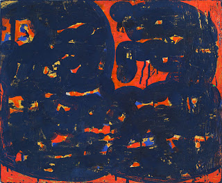
Douglas recently had a solo show of paintings that ended at BravinLee in Chelsea on May 5th.  The show was titled "Dawn Thieves".  The size of the gallery (which is medium to small) and the size of Florian's paintings complimented each other.  There seemed to be approximately 30 works (and I should add that only a few of the images of his work that I posted here are from that show).  Of those paintings not all of them I connected to... but the works that I did connect to, I loved.  I think his best works contain some kind of central shape or form.  The image above is one of my favorite works of Florian's.  The three pink shapes each with rough textured edges immediately draws me into the work.  I can almost feel the surface texture of the painting with my eye.  Then the semi-rectangular blue forms move my eye from corner to corner and the neutral gray background with choppy red patches slowly comes to the fore.  The notch missing from the upper left hand side is a nice surprise... no he's not playing around with the odd shaped canvases that Elizabeth Murray does... instead, that missing corner is a subtlety that doesn't distract but rather compliments the rest of the work by mimicking the blue shapes.  The many elements of this composition function as a whole while retaining their uniqueness; every mark and color has its place... nothing is unnecessary.
Roberta Smith, NY Times art critic,  described his paintings as "intensely worked — painted, rubbed, drawn on, scraped, with added bits of collage and painted paper. Some are so distressed they appear brittle and stiff, as if painted on ultra-thin sheets of metal. Others might almost have been left out in the rain or used as flooring. In any event, many of these works convey an imposing compression of time and attention without ever getting precious or obsessive about it."  As a side note:  I often ponder the concept of authenticity in art... after reading Roberta Smith's description above I realized that, in part, what gives a work of art a sense of authenticity (especially in relation to Outsider Art or Naive Art) is the lack of preciousness explicit in the work.  When an artist is motivated by a vision or process of creating the work and doesn't get hung up on technical deftness of the medium the sincerity of the artist's intent drives the piece.
Back to Douglas Florian... all or most of the pieces that did not interest me had one or two thing in common... either they were all over compositions with little or no focal point or they were not as layered and textured as some of his other work.  I suppose for an artist like Douglas knowing when to finish could be difficult.  His strongest pieces are those that have so much life to them... when you can't tell weather the paint on the canvas is the last layer he added or the first layered he started with.  Those works are most powerful.  


When I first visited Douglas Florian's website (douglasflorian.com) a few years back I read his artist statement and refer it to my friends when they're writing their own.  Check it out...

My drawings are abstract regressionist. They are old but behave like little children.
My drawings are bottle-fed and battle-torn, drawn from the natural and unnatural.
My drawings are homespun hand-me-downs, hands-on and hands-off.
My drawings run in herds, bumping into each other in sequences and consequences, in planned and unplanned obsolescence.
My drawings are music inspired by muses, amusing to muse upon. They are mosaic, and Mosaic, like Moses drawn out of water and drawn with water, but never watered down.
My drawings sing praises and praise singing.
My drawings are movingly still, but still moving, emotional notions about motion, configurations of constellations.
My drawings are sexual and asexual, gestural busybodies, inert and inertial.
My drawings are inaction paintings, made in haste, but never hastily made.
My drawings are light fast and fastidiously light.
My drawings are both drawn and withdrawn. They collect their own thoughts and have a mind of their own.
My drawings are importune and impolite. They don't mind their mannerisms and are temper tantric.
In my drawings form follows dysfunction and function follows friction. My drawings rub me the wrong way.
My drawings are of the body and out-of-body, mindfully mindless.
My drawings are Kabbalah-ready. They daven on the wall, gently swaying back and forth to the rhythm of my rivers.
My drawings are bound in an unbound book, binding and bounding to and fro and fro and to.
My drawings reveal and conceal. They are lost and found and lost again.
My drawings are sight-specific, premature and post-horrific.
My drawings are cut and pasted, posted on a wall. They think big but talk small.
My drawings are modest in size, and immodest in scale.
My drawings are a site for sore I's.

Wednesday, May 2, 2012

Don't Mess With Minimalism: Part 2


A few blocks away from where I was staying in the Montrose neighborhood of Houston, Texas is the Menil Collection.  This museum is one of the most tranquil I’ve been too.  I like to think of it as a smaller Dia: Beacon.  Both are wonderful venues for minimalist art.  The use of natural light, the simple architectural design, the integration of nature… all make the Menil an experience.  Oh, yeah… its free too!  I would suggest however that the Menil scrap its African, Pacific Islands, Northwest Coast, Antiquities, Icons, and Byzantine and Medieval sections or put them in a separate building.  They don't fit the space... but some Minimalism would dovetail with the Menil experience.

The Menil Collection

Dan Flavin


I visited two exhibitions: Richard Serra Drawing (A Retrospective) and Dan Flavin (Installation at Richmond Hall).  Serra's drawings are so reminiscent of his sculptures.  His work is something that you have to be in the presence of... internet images don't do them justice.  As Serra said himself, to not "let the rhetoric of simulation steal away the intimacy of your experience."  His paintstick works are sometimes gigantic, filling  entire walls from floor to ceiling.  They reflect his attraction to textured surfaces.  The way he chose to exhibit them, sometimes just one per room allows the massive drawings to breath and evokes the empty gallery space surrounding them.  Indeed, these works are more sculptural in affect than traditional 2d drawings.  He calls these works "Installation Drawings" and Serra has been making them since 1974.  The brochure for the exhibit (which curator Michelle White wrote) explains that while studying the Mexican Muralists "Serra saw how surface intervention could perceptually subvert physical structures: that a painting of fire, for example, could destroy the column it was painted on.  He wanted to challenge architecture through his drawings in the same way."


Oil Stick on Steel

On display were also four videos Serra had made in 1968.  According the White, "Serra moved to New York City in 1966, an important time for process art, or what has been called Postminimalism.  Along with Serra, artists such as Eva Hesse, Barry Le Va, Robert Morris, Bruce Nauman, and Robert Smithson shared an interest in the tactile immediacy of found materials such as malleauble rubber, lumpy felt, neon, and fiberglass.  The worked on ways to allow the processess [...] to be a visible component of the finished work itself."  I found these works very pleasant to watch... they seemed mantra-like.


His other works included many sketches.  White explains, "Serra does not use drawing as a preliminary step for his sculptures.  In fact, he frequently reverses its typical role and draws his sculptures after they are completed.  As can be seen in his notebooks, Sera does not draw to generate or sketch ideas but rather to respond to the world around him while looking, walking, and thinking."

Sketchbook Drawing

Drawings After Circuit

After leaving this exhibit I felt the same as I did after going for a long walk in Houston's wonderful Arboreum.  These drawings are like forces of nature... quiet, subtle, refreshing, a little frieghtening, unknown, and powerful.  This exhibit and Dan Flavin's brought me back into my senses and resent my mind.